Minimalism is the predominant art form in data visualization, especially for the basic graph. It may bore from Excel’s–the workhorse of almost all basic graphs–not-so-minimalist approach to basic graphs. Formally, minimalism is really meant to minimize chart junk. Glyphs, labels, colors, grid lines, axises are all elements of the graph that are meant to help the reader comprehend the graph. Gratuitous use of chart junk, however, has the opposite effect of making a simple graph unreadable.
Excel 2003 and prior versions produced horrendous versions of graphs. Extra shading and thick lines produced unattractive versions of graphs. The default graphs in Excel 2007 and 2010 improved the quality tremendously, but leave some room for tweaks. Below we’ll review how to transform default graphs to more readable graphs with less chart junk.
Bar/Column Chart
If not already, bar and column charts should be your workhorse. These graphs are usually the appropriate chart, especially if you are using pie graphs. Even sometimes, these graphs should be used in place of line charts. Default Excel settings produce nice, but produces some chart junk:
Let’s clean out the identified chart junk. Starting with the border line, right click in a blank area and click “Format Chart Area”. In the dialog box change the radio button to “No line”.
Removing the legend is quick easy. Click on the legend and hit the delete key. The legend will disappear and the graph will readjust itself.
Next, we need to remove the unnecessary y- and x-axis lines. Right-click on the vertical (y-axis) and click on “Format Axis”. Select Line Color in the dialog box and choose the “No line” radio button. Repeat this operation for the horizontal axis.
Your graph should be cleaned-up. Change fonts and colors to your liking, but the result should resemble this:
Labels
Let’s pause for a moment to discuss labels. And let’s clear up something else. I can’t see the number in this nor any shapes here. I see a yellow square here and a circle here. I lack that appropriate pigmentation in the cone cells located in the rear of my eye, or something. I am colorblind.
It is very difficult to align colors in a graph to a legend to the side. It’s frustrating. For aesthetic, color-blind friendliness, and other reasons, it is usually best to directly label your graphs. A perfect tool for direct labeling is a straight line or bent-line with a ball on one end. You can access these under Insert > Shape:
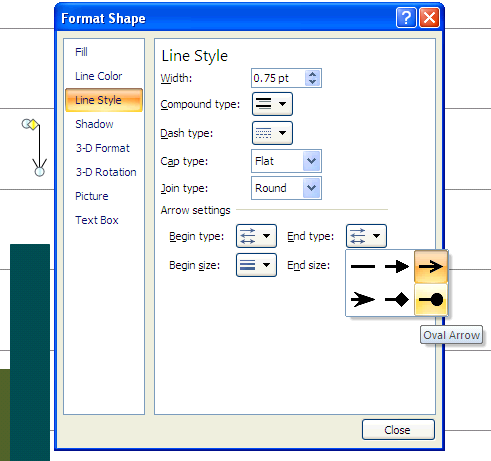
Draw the line, but you’ll need to grab the yellow triangle and move it into place to create a bent line. Right click on the line and click on “Format Shape”. Choose the Oval Arrow under Line Style:
Pair this with a text box, also under Insert > Shape. Align it over a column or bar and repeat.
Scatter Plot / Line Plot
Excel includes a built-in line plot feature. Try to avoid it. Instead, you should approach line charts using scatter plots.
Pie Chart
Be careful mentioning pie charts at a party. They’re either hated or despised. If you want to use a pie chart, first seriously consider a column or bar chart. They can almost convey the exact same message as a pie chart, but better. Pie charts are undesireable because: 1) they’re overused and 2) the human eye perceives pie shapes with some amount of error. If two pie slices are similar, but not equal size, the eye still may think it is the same size. But humans are perceptive at comparing lengths. Bar and column charts, which are premised on the length of a bar, provide a more accurate perception of data.
But, as this course attempts to reinforce, it may be necessary to use a pie chart depending on your audience. At the very least, use a well-designed pie chart.
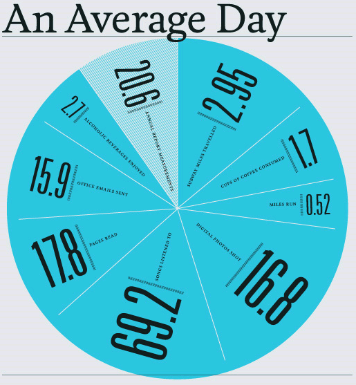
My favorite design is from Nick Felton, a uni-colored pie-graph that uses large labels to convey the data.
Mr. Felton uses Adobe Illustrator, but we can do our best to replicate the same principals in Excel. Start with a basic pie graph. I used some ficticious data roughly based on Mr. Felton’s original graph. Ugly, right?
Identify the chart junk. Extraneous color, pie-shaped object, and labels. Labels are the easiest, just select and press delete. But we need to replace the labels, so let’s label directly. Right-click on the pie itself and select “Add data labels”.
Labels have been added, but they’re an absolute mess. Right-click on a label and select “Format Data Labels”. In the dialog box, choose the options below:
Now let’s make the graph a single color. Right-click the pie and select “Format Data Series”. Under “Fill” select your desired color. To provide some contrast, select Border Color and a white line. I like thicker white lines, which can be adjusted under Border Styles–I chose 2pt. lines.
Not everything is quite right, yet. The labels still look messy. Let’s use a white font on the labels (select the label and adjust the font as normal) and rotate the text. Double-click on a data label you want to change, then right click > Format Data Label. Under alignment we can adjust the text direction. Continue in this fashion until you’re done.
The representation won’t be nearly as accurate. Advanced users should try Adobe Illustrator. Here is an example of a pie graph I created:
Histogram
Histograms and column charts usually get confused. They’re similar, but distinct in one key aspects–there is no space between the columns. You should use these graphs to get a better sense of distribution, especially for variables like age or income.
The sides of each bar touches each other helps convey the idea that the data is continuous (e.g., age) and not distinct categories (e.g., race/ethnicity).
A good data set to start with is age data. To build a histogram, start with a column chart.
Right click on any column to select all of the data points and select “Format Data Series”
Eliminate the gap between the bars by using the second slider. Pull the slider over to “No Gap”.
Now let’s add labels and highlight specific areas with color to replicate the final histogram. I’ve started by switching the color scheme to a pea green. Let’s highlight the average age and median age to a brown color. Double-click on the bar for 23 years-old to highlight that specific data point. Right click and select “Format Data Point”. Note: it says “data point” when formatting a single bar, and “data series” when you’re formatting all of the data.
Use the fill option to change the color.
Repeat for 19-years-old, add data labels, and clean up other chart junk to finalize.
Rejoinder
Data visualization is usually associated with large, fancy designs. But recall the initial conversation in the introduction: good data visualization must involve basic graphs learned a long time ago and also more complicated infographs. These basic graphs are your workhorse, they’ll be used more than any other graphic. Improving these graphs will drastically improve the quality of reports and increase comprehension.


