Bar charts, line charts, and pie charts…oh, my. Even improving these charts can still lead to a pretty dull layout. Data visualization has gained in popularity, for the most, because eye-catching charts are, well, eye-catching. Usually a graphic designer or statistician needs to create something outside of the traditional basic plots, something outside your Excel’s “Insert” menu. Yet, these graphs need to stay simple, with the same feel as a basic plot.
Bullet Chart
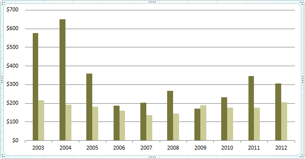
Pop quiz, you need to compare your local college’s graduation rate to the national graduation rate. What chart do you use? Question 2; you need to compare your actual expenditures to budgeted expenditures. What chart is utilized? If you answered bar graph, then congratulations. But that is so dull.
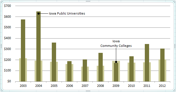
Bullet charts, envisioned by Stephen Few [pdf], provides a much more interesting take. It is a simple idea, as most good ideas are, that simply overlays a skinny bar within a thicker bar, providing a very easy comparison between the two. It is also relatively easy to create in Excel.
Start with a bar plot, there should be at least two bars.
Right click on the bar you want to be the “bullet”–the slender bar “inside” the larger bar. Right click on that data series and choose “Format Data Series…”
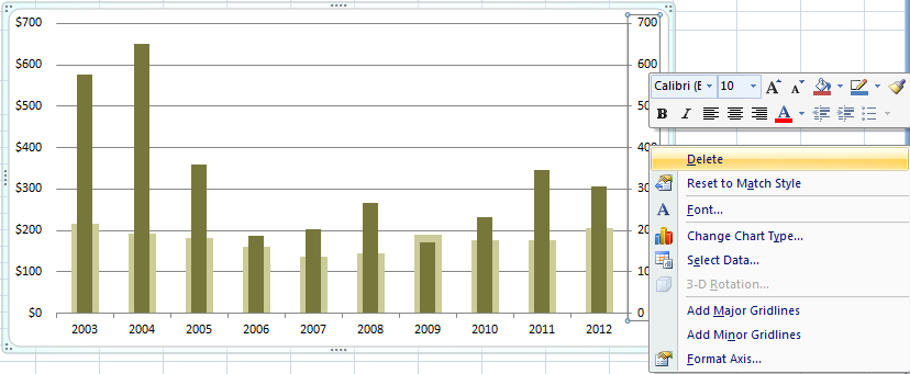
Choose to plot the data on the “Secondary Axis”. A secondary axis will appear, right click on the secondary or primary axis to adjust the scales. The minimum, maximums, and major unit need to be the same.
Right-click on the bars, use the slider to adjust the gap to make wider or narrower. Here, I have made the green bar wider.
Delete the secondary axis, but ensure the minimum and maximum values are the exact same.
Add any labels, change colors, fix fonts to taste.
Bubble Plot
Bubble plots have increased in popularity, but are often mis-applied. The idea is to show bubbles–or circles-–relative in size.
Bubbles with a larger area, naturally, means more. But it’s easy to misapply these types of charts. Remember the formula for area of a circle is Area = π * r2. If you want a circle that is 20 percent bigger, it’s important not to only increase the diameter by 20 percent, but the area. You can use the formula Area /π = diameter.
Example 001:
The base bubble (with “8,596 Full-time Students” written in the center) has an area of 1 inch. What diameter does the bubble need to be to get this? Knowing our area needs to be 1 inch, then 1 = π * r2, which rearranges to √(1/π) = r, which calculates to 0.564. Set the width (diameter) of the bubble to (0.5642 =) 0.318 inches and bingo.
Example 002:
Now you need a bubble that is 20% bigger than the 1 inch bubble. First, find the new desired area with 1″ * 1.20 = 1.2″. Now we need to find the needed diameter. Let’s use the shorter equation, so Area = 1.2″ will require a diameter of 1.2 / π = 0.382 inches.
Bubble plots also succumb to a similar problem as pie charts. It can be difficult for the human eye to distinguish between bubbles of similar size. The above chart–one I created–does not address this well. If possible, it’s best to use bubble that sit side-by-side.
Ladder Plot
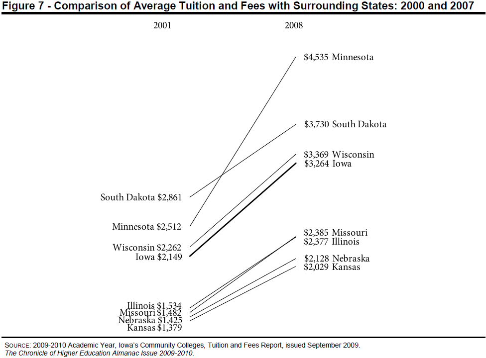
Another Tufte invention, and one of my absolute favorites. Suppose you need to track the change in average college tuition between five states for the past five years. Typically, one jumps to the line chart: one line for each state with five data points for each year. We all have done this and we all seem to ignore the graph looks messy. Dig deeper and you realize that people only care about two things: are we higher than five years ago and where do we rank–people always ask the latter. A ladder plot shows exactly that, and it is much cleaner. It is essentially a line plot, but the variation between has been eliminated and both sides are labeled.
This graph can be difficult to create. There are several options, the first is a program–not Excel–that can create these charts. But this program provides little user control (unless you know Python). An Excel template is also available. The above chart was created using the Excel template provided by Juice Analytics.
Typography
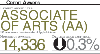
Sometimes you can go crazy trying to think of a way to visualize data. You may struggle to contort an image to convey something, but sometimes a word is far more power–with some fancy typography, the mistress to all data-viz lovers. For yours truly, using a word or a single as a means to convey data was an eye-opening experience when I read Nick Felton’s annual report–a report that describes his own life.
His use of typography and simple words is quite interesting. Readers usually anticipate graphs, but this provides a refreshing break to the hum-drum of common plots. The report is so well received, he quickly sells 3,000 each year. And that’s just to find out that Stella Artois is his favorite beer.
Below is an image of the implementation of typographical data boxes in the Iowa Department of Education’s Annual Condition of Iowa’s Community Colleges:
The beauty of this graph is usually derived from the font. Not everything on your computer is Times New Roman or Arial. Times New Roman is fine, but boring. Arial is a bit ugly, users should opt for Helvetica instead. I won’t delve into the font fetish in detail, but I recommend reading Typography for Lawyers. It describes good fonts for use in a professional setting. Usually these fonts cost money, so I also recommend browsing The League of Moveable Type for free fonts, especially Goudy Bookletter.
Faceting
Bar and line graphs can quickly become overwhelmed and cluttered. When showing more than 5 categories of data, and especially for any graph with more than 7, you should facet your graph. Faceting can also be called multiples or n-tuple graphs. Technically, faceting is a technique more than a graph.
This is an extremely manual process, unless you use ggplot2 in the R statistical program. It requires the author to make each individual graph and to thread them together using, in Excel, the “group” command. You’ll need to keep a few rules in mind:
- Make the x and y axis the exact same size.
- Use a consistent color theme, no need to make lines on each cell a different color.
- Align the graphs on a grid.
Graphical Suicide
I use the term “suicide” in the context of a slushy, not the morbid context. That is, you can combine graphs to produce other non-traditional graphs. Below is an example from a New York Times’ article on cancer deaths that combines a bullet chart with a tornado graph. This two-dimension graph displays three dimensions of data: gender, type of cancers, and new cases or deaths. This graph also uses direct labeling to distinguish between the two colors. A tutorial of this graph can be found here [.mov].
A report should consist of a blend of these chart types to keep the reader interested, but don’t overwhelm her with a random array of graphs. This is also true for a basic infographic, which uses several basic graphs to create a poster to convey data. They’re all the rage lately and the topic for the next section.


