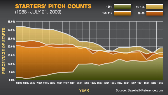
ESPN’s interesting article on pitch count also contained some ugly graphs. The articles thesis is on starting pitchers now regularly pitching fewer than 100 pitches.
Exhibit 1: Transparency and Area Charts
Area plots don't work well when they overlap. The above chart had to use transparency, which makes it difficult to associate colors with the key.
Also, ESPN appears to have plotted everything available instead of focusing on their argument. The overall point is to show how the number of pitches for starters--especially those with more than 100 pitches--has declined. It would be cleaner if they plotted what they wanted to show: the percentage of starts that ended up with more than 100 pitches.
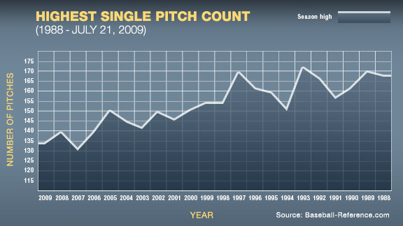
Exhibit 2: The Descending Axis
Two errors were made on exhibit 2. First, the x-axis (horizontal) starts at 2009 and goes back to 1988. It caught me by surprise since the slope was opposite of the argument of the article (positive instead of negative). Instead of glancing to get the idea, it wasn't until I read the axis that I understood the odd plotting behavior. In the end a simple rule: the x- and y-axis should always start at the lowest number and continue to ascend.
Second, the oft-made mistake by not starting the axis at the appropriate spot (either 0 or 100 in this case). While 100 would make sense as the beginning of the y-axis (vertical), I would still prefer zero to maintain the appropriate scale. Using a scale greater than zero will over-emphasize the movement and make troughs or peaks appear significant while they usually are not.

