This post is a part of a collection for an upcoming course on Data Visualization at the 2010 Mid-America Association for Institutional Research annual meeting. These posts will be collected and placed on the course website. They may also be modified as the course develops to increase clarity.
An Economist article quotes Hal Varian, Google’s chief economist, who notes:
[A] new kind of professional has emerged, the data scientist, who combines the skills of software programmer, statistician and story teller/artist to extract the nuggests of gold hidden under mountains of data. (emphasis mine)
The demand for data scientists has arisen from a growing source of data. From the same article, the Economist notes that Walmart generates 2.5 PB (that’s peta-, or 1,000 TB) of data every hour. That’s equivalent to the Library of Congress every 21 seconds.
The data scientist is a bit of a nefarious term. Statisticians have, for quite awhile, propagated software for analysis–computers are synonymous with counting, used sophisticated statistical techniques, and use graphs to provide a story. John Tukey, a notable statistician provided developments in all three areas. Statisticians in graduate schools are also exposed to all three aspects.
Nevertheless, there is a need for statisticians/data scientists to expertly handle the growing fields of data. The growth of data means more stories are being told and in order to be heard, statisticians/data scientists are resorting to pithier forms of communications, relying more on data visualization. While sometimes referred to as “art”, it is and is not “art”. Like most art, data visualization is interpretive–some people will love a particular visualization, others will not be able to understand it. However, data visualization is objective in the sense there is a clear right or wrong, where a statistician can simply lie to the reader.
There are at least three categories of data visualization: basic plots (e.g., line chart, bar chart, pie chart); basic infographics; and complex diagrams. While there are basic tenants of good graphing principles, each specific category has its own set of basic rules. Each has strengths and limitations.
Basic graphs are the fundamental graphs that nearly everyone is familiar with: line chart, bar chart, column chart, histogram, scatterplot, pie chart, area chart. It also includes some more esoteric, but fairly common graphs: radar charts, bubble plots, and dot plots, for example. The defining characteristic of basic graphs is a graph that consists of two or more axises that are explicitly labeled with data. In addition, there is marking or glyphs the plot the data against those axis.
Basic plots needn’t be boring, they just tend to be. Edward Tufte transformed basic plots by applying a minimalist approach. For instance, a scatter plot typically contains two solid axis (x and y) over a range. But why, as Tufte asked, show the entire range of the axis? His solution was to only mark the axis with a corresponding data point.
You can also let users explore basic plots interactively. Hans Rosling presented GapMinder during a speech at TED. He used bubble/scatter plot with a timeline to demonstrate trends in poverty and equality. While there has been extensive research on the topic, Mr. Rosling’s presentation was vivid.
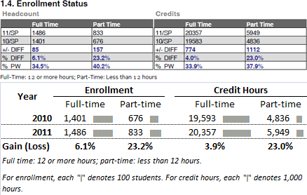
Shrinking basic plots also gives them new life. So-called dashboards contain many medium or small basic plots to present a slew of data in one sitting. Ryan Case and Nicholas Felton’s Daytum application lets users document their life data which can be presented as a dashboard. Word-size plots are known as sparklines. It can be helpful placing these graphs next to numbers in a table. Trends and finding the largest number is quite simple with the help of sparklines and can provide a balance between giving the specifics to those who want them and showing general trends.
The second category I suggest is called basic infographics. Although I refer to them as basic, it is not meant to downplay the impact of these charts. Basic infographics are often a collection of basic plots in a single diagram with a single theme. Basic infographs have risen in popularity in the past few years. One of the earliest and most popular infographic is Death and Taxes by Jess Bachman. The infographic uses bubble plots to plot the size (in budgeted dollars) of various federal agencies. Readers can get a very quick overview of budget allocations–Defense is obviously the single largest recipient of discretionary funds–or a very detailed analysis–Howard University received $235 million.
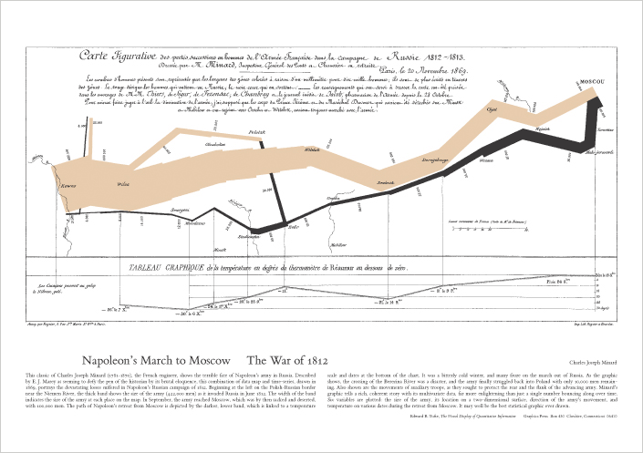
Hundreds of others have also created basic infographics: Nathan Yau, GOOD Magazine, and Nicholas Felton are some excellent examples. Again, Edward Tufte contributed to this segment as well. He highlighted Charles Joseph Minard’s Napoleon’s March as ” [p]robably the best statistical graphs ever drawn.” The beige color represents Napoleon’s men marching into Russia, the thickness gives the number of soldier at a given position. Notice the line becomes thinner as the army marches into Russia’s cold winter. The black line shows the number of soldiers as he retreated. France’s army was still thinning as they retreated.
There is plenty of debate over Mr. Tufte’s love of Mr. Minard’s infograph. Some think it’s difficult to understand or follow, others agree with Tufte. This leads to a third category: complex infographic. Complex plots use a connection of lines, bubbles, and angles to communicate data. Often, they use plots that are unique and not within basic plots. Minard’s graph could be classified as a complex plot. It uses a graphing mechanism that is not readily familar to most readers, thus, the furor over the usefulness.
Complex diagrams arose from the explosion of data in the past decade. More data means exploring more complex interactions, which means using more complex means. The Economist recently noted Walmart generates 2.5 TB of data every hour. While education doesn’t generate as much data as Walmart, we have seen a huge growth in data. The Institute for Education Sciences has spent over $300 million on funding databases that track every students from K-12 education through postsecondary education and into the workforce. Iowa’s longitudinal dataset contains over 2,000 variables on any given student in a given year. Likewise, Iowa has also created complex infographics showing the transition from college major to the workforce.
Taxonomy and Practice
The above taxonomy is important in determining data visualization in practice. Basic plots are widely accepted and used in publications. They typically do not create furor, but they are easy to poorly implement. Basic infographs are becoming popular and can easily supplant reports. Sometimes they encounter resistence, especially when they are perceived to be too complex. Finally, complex infographics convey a tremendous amount of information, but can easily confuse non-technical readers. The diagram above, for example, plots the relationship between open source projects hosted at GitHub.
There is tension between these categories. In 2008 Mr. Yau suggested the 5 best data visualization projects for the year. Three of the five (#1, #2, #4) could easily be categorized as complex infographics. The rest are basic infographics. Andrew Gelman, a noted statistician with an occasional emphasis on data visualization, disliked all five choices. In the ensuing dialog, it’s clear Mr. Yau favored the basic infograph or complex diagram where Mr. Gelman seemed to have an affinity for a well-executed basic plot, “[m]y taste in graphics is similar to George Orwell’s preferences in literature, for prose to be like a windowpane or whatever it was that he said.” Complex infographics are not minimalist. They are not universally loved. It all boils down to taste.
Middle Road
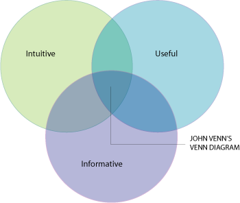
Yet, data visualization cannot succeed if the audience does not agree with the aesthetics. Researchers need to be sensitive to the taste of the audience. But with a variety of audiences in public education (e.g., politicians, educators, researchers, public), it is easy to be lazy with a basic plot or to spend too much time on a complex infographic. Both will alienate many readers. Thus, I suggest one seeks a middle ground and balance simple design with beauty. The designs should be intuitive, useful, informative to maximize their reach. Basic plots can limit the data, complex diagrams can limit your potential audience.
Each category has basic rules. This course will introduce those basic rules so you can produce readable and clean plots, infographics, and complex plots. We will try to strike a balance in the examples for this course–and at times we will fail. Of course, as we learn the plots we also must learn the tools. Basic plots can be beautifully designed in Excel, but only after editing. Adobe Illustrator is also an indispensable tool for those serious about data visualization. We will also review emerging technologies, like Processing and Adobe Flex.


Improve your google rank today check this out! http://goo.gl/YzNKa