


PowerPoint and Excel aren’t the enemy, though a lot of people to seem to think they are. Frequently, I hear others say “don’t use PowerPoint” or snicker when someone mentions conducting analysis with Excel. This is wrong. There is nothing wrong with Excel or PowerPoint; I am a fan and user of both programs. The problem is the creativity and capability of those using those programs and it’s time to realize that.

There is a problem here, but it’s not the software.
A number of speakers urge people to stop using Excel (with a haughty, better-than-thou approach) and move to more advanced software like R. But there are a number of reasons why switching from Excel to R or Python as the primary analytic tool is a terrible idea: it requires a steep learning curve that can delay projects. Likewise, it’s easy to blame PowerPoint, but PowerPoint’s fault is being the predominate presentation software. It is as easy to create terrible presentations in Keynote, Google Docs, and doubly-so for Beamer. But PowerPoint is one of the best tools for creating presentations: it’s powerful, prevalent, and familiar to users.
The problem is how users approach the software, attempting to fill-in the pre-formatted bullet points. PowerPoint is a blank canvas with robust ability to add shapes, images, text with a quick ability to organize, layer, and animate each element. Likewise, the default Excel graphs can be improved as well, but simply requires the user to think outside the default. R, Python, and any other high-power language gives you a completely blank canvas, which requires you to fill in all the blanks. Excel and PowerPoint give you a template, users just need to break through to get to better outcomes.
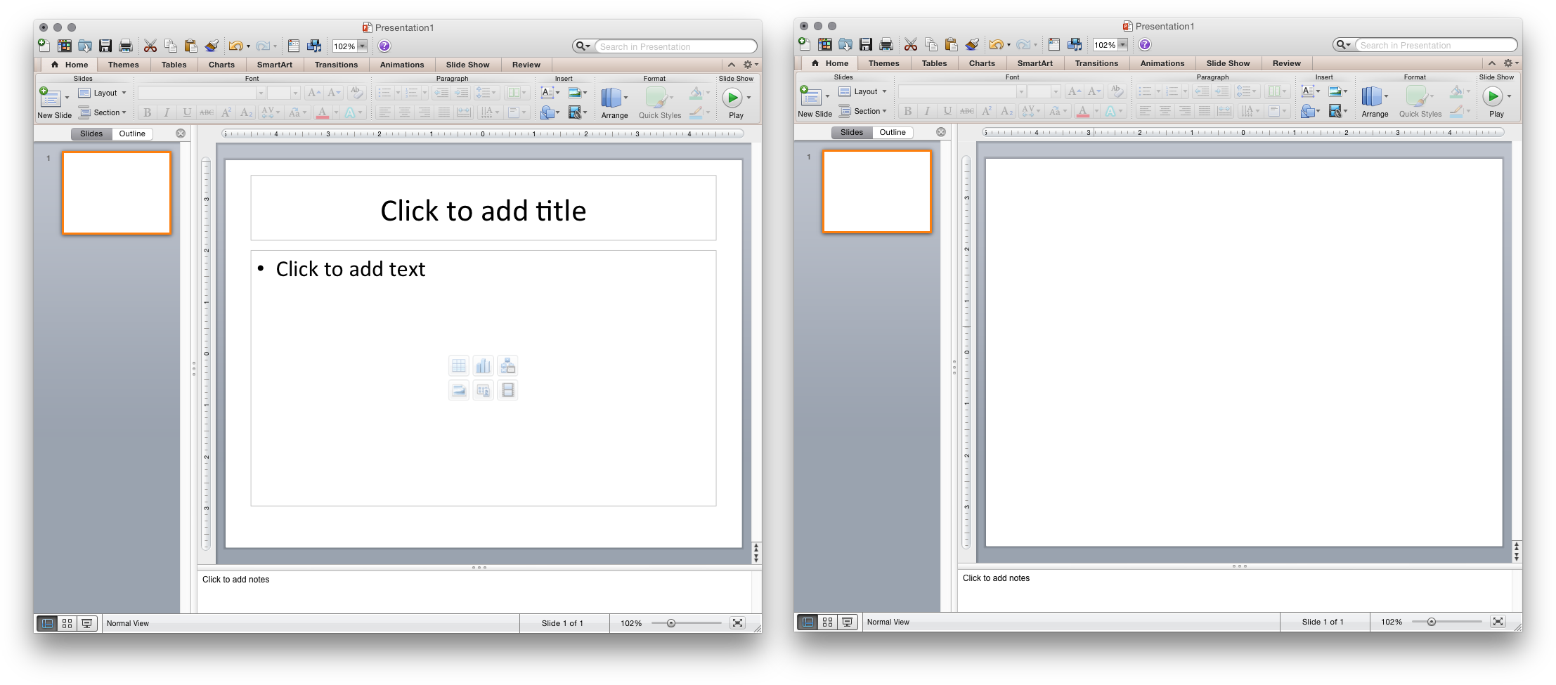
Left: Default PowerPoint template encourages poor practice. Right: Viewing PowerPoint as a blank canvas for display shapes, objects, and media is the best practice.
Often, headlines rail against PowerPoint and the culture it propagates. Unfortunately, most people only take the headline home. Edward Tufte is a well-known anti-PowerPoint author, leading to dramatic headlines (not unlike my own) that PowerPoint is bad. But his point is more subtle, railing against the lazy culture of throwing slides against a wall with no preparation.
Replacing PowerPoint with Microsoft Word […] will make presentations and their audiences smarter. Of course full-screen projected images and videos are necessary; that is the one harmless use of [PowerPoint]. Meetings should center on concisely written reports on paper, not fragmented bulleted talking points projected up on the wall.
That is, there are appropriate and inappropriate use of PowerPoint–something true of almost every software. Thus, it’s the imagination and use of PowerPoint–not the tool itself–which creates the issue.
Breaking through defaults
Users need to be trained to view PowerPoint different, to view it as an empty canvas in which to communicate with others. Failure to create a compelling presentation is often a failure of the author, not the tool. In my own experience, the largest hurdles are creating sensible animations and the inability to quickly embed YouTube or other videos.
Even for visualization, Excel is a fantastic tool. I see as much chart junk on ggplot2–though I love ggplot2–as Excel, but both can be easily cleaned-up.
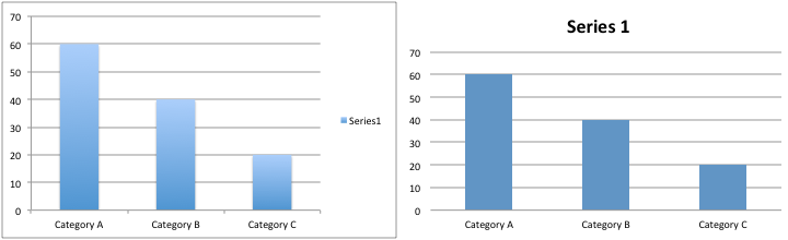
Do-ers, who I appreciate more than thinkers, have given practical advice for data visualization in Excel. Juice Analytics has a wonderful chart chooser tool, which provides clean, minimalist Excel chart templates. Stephanie Evergreen, a data visualization consultant, has provided lectures and workshops that primarily focus on Excel visualizations. Whether Tufte, Few, or others, the groundbreaking visualizations created by leaders in the field can be replicated in Excel if you’re willing to change the defaults.
Think about the objective, not the tool
Snickering at Excel and PowerPoint has a real, substantial side effect. People who use these programs develop inferiority complex about knowing these programs, seeking out to only do analysis with R and other more complex tools. It’s always good to seek new knowledge and challenging yourself, but this can also be misguided. It’s important to think about the objective, then to think about the best tool to achieve it.
Any tool is never a pancea for everything, trade-offs always exist, so it’s important to see when Excel fails to do a good job. A rule of thumb I follow is this: avoid Excel if you’re going to have to repeat your analysis. Projects which require multiple steps in computation–such as summing rows, then summing columns, or other steps–are very hard to quickly reproduce unless you are replacing data of equal rows and columns each time. Repeating complicated analysis is not only hard on the user, but susceptible to error that can’t be easily detected. R, Python, and other scripting tools can be written once and repeated always–but that scripting can take longer.
PowerPoint–even when it’s executed well–is not always the right tool. Sometimes it’s more appropriate to circulate a report, one-pager, or use another medium. For that, you need to judge how you want to communicate with your audience, not only thinking about which tool you want to use. Consider how your audience may want to consume that information and the best way to maximize their involvement. Consider your goals: is the mission to get them hooked? To provide a just brief overview? To galvanize support? To engage them deeply on a topic? Each one of these may have a different approach, where PowerPoint may or may not be appropriate.