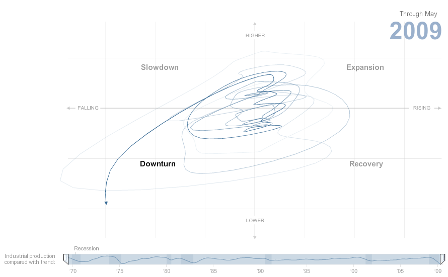
The New York Times built an interactive graphic on business cycles since the the early 1970s. Instead of displaying a business cycle as something that looks like a sine wave, NYT uses a Cartesian plane with each quandrant representing either expansion, slowdown, downturn, and recovery.
They use industrial production as a proxy for the business cycle. The text says industrial production data “suggests that the economy is poised to turn around…”, but I don’t quite see how the data supports the claim.
Instead, the main indicator that indicates a recovery is the OECD Leading Indicators index (which includes industrial production as a component). OECD Leading Indicators are increasing relative to the historical six months, and, as the graph shows, industrial production will eventually following the leading indicator. Nevertheless, industrial production isn’t increasing–yet.
Corr(Downturn, Recession) = Weak
After messing around with the data you’ll notice that the “downturn” region isn’t correlated with actual recessions. The data tends to traverse the downturn region after the recession has already passed (you can see the recessions as the shaded regions in the timeline below). In this case, the “slowdown” region is correlated with NBER-dated recessions. However, this highlights a good interactive graph since the user is able to explore these trends.
Updated. Once you hop over to OECD’s website, you’ll notice that OECD considers “downturn” as the upper left quandrant and “slowdown” the lower left, as I’ve terribly illustrated below. I think the data supports OECD’s labeling. I wonder why NYT decided the swap the two.

(via FlowingData)


