I received the last Annual Report by Nicholas Felton. It is his 10th report in a series that began with a thin volume in 2005. I hesitate to say that I’ve “finally” received the report because I was not anticipating the conclusion of the series in any way. Instead, I had always looked forward to these reports, buying several copies of the sturdy, well-crafted, lithographed paper.
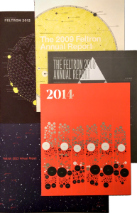
His annual reports were quite important in my venture into data visualization. While at the Iowa Department of Education, I had the daunting task of implementing a higher pedigree of research while also explaining it to legislators, lobbyists, educators, my boss, etc. It is one thing to move quickly with data, it becomes more complicated when you everyone else must keep pace. At this point, data visualization became a serious tool to overcome this barrier.
The influence from Felton’s reports was rather cynical. Frankly, his reports were banal trivia about his personal life that ranged from his favorite beer to his repetitive habits. But, the reports were engaging and were incredibly interesting to peruse. It’s quite remarkable to draw in thousands of readers about someone’s life, which leads to the simple observation that I expressed to colleagues:
Nicholas Felton is able to sell 3,000 of his reports that show his favorite beer and quirks for $30.00 a piece. We couldn't give away an education report--one of the most important topics--for free to the public. Clearly, we needed a new approach.
Felton’s execution of the report brought the readers to attention, despite the rather personal subject matter. It seemed we–in the education community–could bring the same interest to a more weighty, significant topic of education by focusing on communication and data visualization. I sought to mimic his success, in part, by looking for inspiration in his approach.
Below, a comparison of two reports: The Condition of Iowa Community Colleges 2006 and The Condition of Iowa Community Colleges 2008. The latter report was significantly overhauled by my team under my art direction. It incorporated several “Felton-esque” approaches: word-based infographics, call-out fonts, and a ”graphs first, no tables” approach.
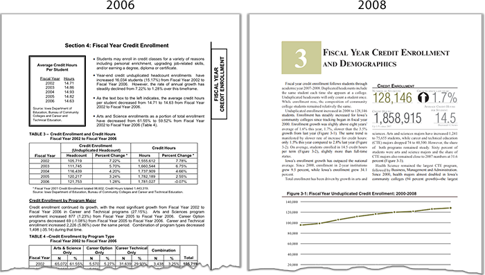
The bullet points on the older report were replaced with large numbers, arrows, and subtle captions in 2008. Likewise, the tables in the 2006 report buried the trends that many people were looking for. On the right, you can see the direction of enrollment and whether it is steady or sharply changing.
In addition, while data visualization was a key part, it’s hard to escape that good design principles also needed to be included: a high-quality, efficient font, respect for white space, and a pleasing, sensible color palette. This design-first approach let us add more narrative while also reducing the pages. The improved layout helped improve readability as well.
Felton’s annual reports were a key influence for me and helped our team engage better with stakeholders. While I look forward to his future work, his annual innovations will be sorely missed.